Review of Artwork & Exhibitions - Past and Present
THE SPARK

Apple by Jay McNeill. Photo by Robert Batey
When I received the invitation to be the juror of the 21st Sevier County Biennial, I felt honored and a deal of responsibility. I had heard of the school but I wasn’t aware that this exhibition was open to the entire county. After learning more about the campus, people, and the region as a whole, I came to realize how essential the arts are to this community and how vital the Arrowmont school is as a creative hub and artistic escape.
In my curatorial practice, I don’t believe in good or bad art, only weak or strong- and even that is dependent on elements such as time and the environment it lives in, so whenever I’m asked to be a juror, I typically break down my judgment into 5 categories:
First impression/Aesthetics
Technique
Intent
Impact
Originality/Style
For this exhibition, I began this process giving each piece time and attention (as I like to do whenever I explore art). However, as I was approaching piece #30, I realized I didn’t have the energy or time to continue like this for 157 more works, so I decided to treat the process like a gallery, only stopping at works that immediately spoke to me (Category #1). This decision helped me narrow down my selections a lot quicker, but it also enabled me to avoid pieces that possibly deserved more attention. I knew I’d return to the other works the following day, but I didn’t plan to devote too much time to them as my excitement had already subsided.
Jumping into my second day of jurying, I felt pretty confident in my choices. That was until Heather, the Gallery Manager, informed me that I had only chosen about 35% of the submissions. She didn’t ask me to change my selection process, but to keep in mind that the space is large enough to hold more. I thanked her for that because in a very subtle way (or maybe just in my interpretation) she reminded me to open my eye wider. Not every work of art has an immediate impact (Category #4). Some works, like people, require more engagement than the first impression to truly understand who they are. This is evident in various art styles from Impressionism to Cubism, Abstract Expressionism and Crafts. After this epiphany, I no longer focused on my obvious choices. I decided to give time to the not-so-obvious choices- the works that for some reason or another captured my interest and spawned questions. Does the piece move me to understand the artist’s story? Does the work inspire me to create my own story? Do I want to know more? These curious* thoughts are the effects of strong pieces whether they’re perceived as aesthetically beautiful or not. At the end of the day, that’s what art is about: the spark and need to know.
The piece I awarded Best in Show may surprise some people as it’s simply an apple, but it blew me away. The woodwork and intricate lines are exquisite, and the color palette is great- just enough to catch your eye without being overwhelming. The fluorescent-like green that appears inside is a nice surprise but it's all brought back to reality by its true-to-size form. Those were the aesthetics that pulled me in, but what impressed me the most is how the artist took something so elementary, a fruit- one of the first fruits we learn and so easily forget about, and created an interpretation that still lingers in my mind to this day. I wondered: When was the last time I stared at an apple? Have I really considered its journey from being a seed, to a tree, to a fruit, then back to a seed? What color could represent the burst of flavor? Realism and still-life art can sometimes be stagnant, especially in the world of crafting, but I could sense this piece was made with great intention. There was a stillness and wholeness that I saw in this apple that felt complete and I genuinely enjoyed engaging with the work.
The other pieces I awarded had similar effects on me in regards to appreciation and wonder, and I’d like to thank those artists for creating that experience for me, including those who didn’t receive an award. As a staple in the community, the Arrowmont School of Arts and Crafts stands as a reminder to visitors to not only stop and take it all in, but appreciate the process. Thank you Arrowmont for offering solitude that allows artists and art appreciators to reconnect with their natural environment, tap into themselves, and focus on being and creating their best.
*Curiosity is one of the main qualities of Sevier County from the interest attractions like Ripley’s Believe It or Not, to the quiet mountain views of the Anakeesta. People visit from all over to see and discover something.
THE SOCIALIZED EXPERIMENT
It’s a challenge to capture the beauty of the female form without a sense of sexual intention- especially during this age of King Mag and social media models. Joseph Patrick, however, has mastered the technique of allure storytelling, creating an ideal example of what figure photography should be. Fitting right in with fashion advertisement, his work acknowledges every detail while still keeping a balance between the scene, the model, and the object. Lighting and formation go into play as Joseph and his models produce, as he says, “a visual language,” where through his lens, viewers experience his narrative of the world and the people around him. Black women are his typical muses which, as a Black man, he feels no need to explain why. He lets the camera showcase the strength and complexity of their being as it’s enunciated with the variation of their hair patterns and skin tones. The looks of his subjects add to the depth of creativity he can explore, such as with his recent project: The Socialized Experiment. In this, Joseph explores the conversation of Black mental health by taking influence from Rorschach-esque (ink-blot) imagery, creating the shapes via Black models. As with typical ink-blot sessions, he aims to pose the question of “how do you feel?” instead of “what do you see?” These timeless shots of nude figures covered in ink have the power to stop you in your tracks. His coming projects will continue to cover societal themes in regards to Black and Brown people, and he’s also looking to get involved with cultural artifacts. Regardless of the subject matter, you can always expect Joseph’s photos to hold an essence of unplanned perfection and grace- a raw happening captured on film.
More of Joseph’s photography and information can be found HERE.
THE REDEMPTION
Transitioning from performance to photography was the first major step of Tawny Chatmon’s career. She credits her artistic growth to that creative shift and two life-changing moments: the birth of her child and the death of her father. Since then, her work has created moments of hope, beauty, and purpose, for viewers as well as herself. Her recent series, “The Redemption,” focuses on her adolescent subjects evoking majesty and pride, as they translate the beauty and versatility of black hair. Combining her photography skills with her Gustav Klimt inspired use of gold leaf is the perfect formula to producing enchanting visuals that resonate with her viewers. Tawny’s other series of work also share the theme of ancestry and African American culture, while also incorporating inspired styles and past art history movements. Tawny goes the extra mile by adding paint, digital manipulation, and the eyes of elders to her photos, amplifying the energy of her figures. As mentioned on her website, her art is “more than just a work of photography but a new compositional expression.”
More of Tawny’s work and information about her documentations can be found on her WEBSITE.
PISH POSH
PISH POSH. Although the term itself is defined as “nonsense,” the Pish Posh Girl (aka Emani) is far from absurdity. This visual artist has mended her painting skills with her fashionable instincts and taken flight. As a recent college grad (as of 2019) that simultaneously balanced her business and classes, she’s already gained strong traction on social media and the recognition from heavy hitters in the music industry such as rapper Big Sean. Pish Posh Apparel is heavily influenced by and reflective of the hip-hop culture involving over-sized wear, bold lettering, and bright colors- all designed by her. This clothing line is meant to be loud and recognized- custom made for those individuals who (like Emani) are unapologetic in expressing themselves. Emani is an advocate for originality through both expression and technique, taking pride in every inch being hand painted. This technical detail brings more appreciation to artistry itself, as we are in the era of prints and reproductions, forgetting the rich substance of original artwork. Pish Posh Apparel is bringing us back to creativity via transformation- a great example of what it means to make something your own.
More of the Pish Posh Apparel can be found HERE.
BROTHERS
This work is the official cover art for the recently released “Brothers” song, featuring Kanye West, Charlie Wilson, and Chris Stylez. After hearing the track months prior to its’ premier release in the BET series Tales, Genesis created a piece representing what he felt encompassed the story that Kanye was telling. The endless pairing of names in the background help emphasize the theme and title of the work reigning front and center. Most of the individuals are accredited and known for working in the same realm, but have notably different styles of execution. Genesis translated this push and pull relationship through the aesthetic of the entire piece. The black drips on the red shades combined with the sharp shaping throughout the work add a feeling of angst. However, the open areas, bits of bright colors and boxed message of “BROS” add an element of breath and room for reconciliation. To learn more about the making of this piece and the song, read the recently released FORBES article.
More of Genesis’ art can be found HERE.
Frida Kahlo, Diego Rivera, and Mexican Modernism from the Jacques and Natasha Gelman Collection

Frida Kahlo, 1939 by Nickolas Muray // Portrait of Nazario Chimez Barket, 1952 by Emilio Baz Viaud
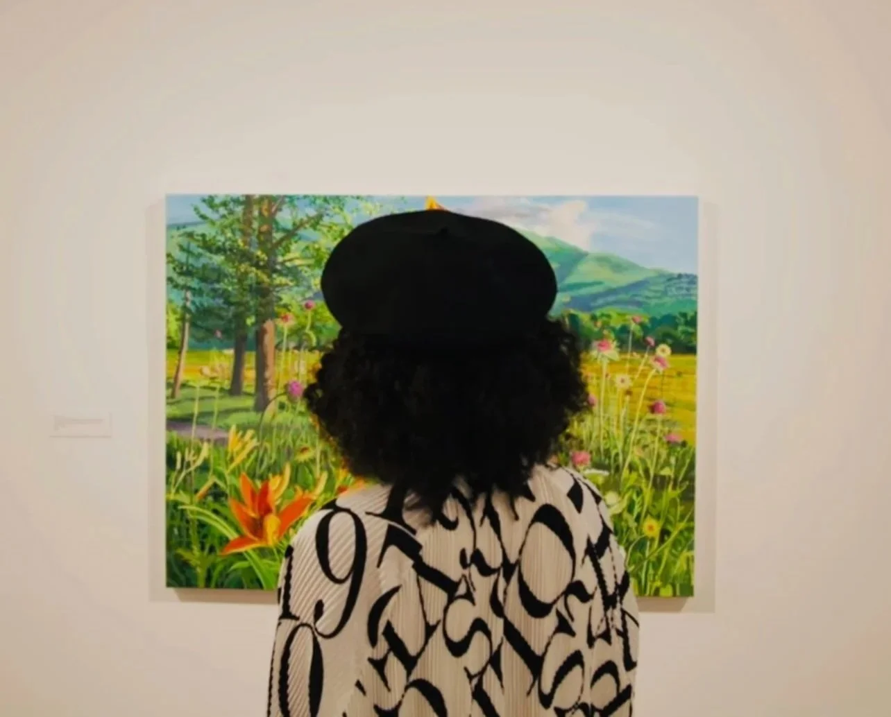
The entire exhibition has a different approach because it technically isn't an exhibition- it's a collection. Guests are learning the story of the artists through the lens of collectors, Mr. & Mrs. Gelman. Unlike other exhibits, Jacques and Natasha Gelman had no curatorial motives behind their artwork selections; they purchased what they loved, i.e. the process was completely subjective. This detail makes the experience throughout the gallery more intimate and personal. Speaking of personal, the venue of this collection is the Frist Art Museum, a creative space dear to my heart located in Nashville, TN. This museum is recognized for it's advocacy of supporting contemporary and pioneering artists alike. This particular collection holds true to these values as the featured work not only consists of the two headliners, but other lesser-known artists as well. Most, if not all, of the other artists are connected to Diego or Frida is some way. Emilio Baz Viaud, for example, was a student of Frida. He has 2 beautiful adjacent portraits on view, one of which mirrors the composition of a Frida photograph by Nickolas Murray (a lover of Frida) in her Guatemalan wear*. With all of the various stories and links throughout the gallery, my assumption is that the Gelmans not only purchased work for their aesthetics, but also for their narratives. The artwork ranges in mediums from videography to fabric to of course painting and photography. The in depth presentation of the artists as people instead of celebrities, yields an appreciation to the curator, Trinita Kennedy. Although, a video compilation of the loving couple playing steps away from the Portrait of Christina Kahlo, 1934 (Frida's sister who had an affair with Diego) is brutally ironic. It is, though, also undoubtedly honest and transparent. It's no secret that the Rivera and Kahlo relationship was extremely rocky, so props to her for putting it front and center just as they did. One note I have is the noticeable difference between the amount of works by/of Frida in comparison to her partner, Diego. The life and death of Frida are observed in this showing while only snapshots of Diego are shared. This isn't a complaint, but more so an observation of what seems to be bias. It is, however, vital to note that Diego was predominately a muralist and heavily involved in politics, so it would be more difficult to collect his art and photos. It could also be considered that the Gelman's favored Frida's work over his. Today, Kahlo is recognized on a much larger scale than her husband (the complete opposite of their past roles), and this collection has been accumulated since the mid 1900s. With that being said, maybe the Gelmans saw a light that deserved attention in Frida, knowing eventually the world would too.
Yayoi Kusama: Infinity Mirrors

The priority to see versus the priority to be seen was the social dynamic witnessed at the Yayoi Kusama: Infinity Mirrors exhibition at the High Museum of Art in Atlanta, Georgia. Social media was the driving force that elevated the anticipation of this showcase and fostered an immense amount of free advertisement on behalf of the museum. With social networking being such a huge asset, the question raised is: was this part of the plan? The purpose of the exhibition was to create an altering experience and Kusama successfully achieved that goal with this eccentric installation. The artist transcended audiences, reaching the typical as well as the atypical art crowd with works that are visually compelling and interactive. The mesmerizing palettes and trippy movements of her Infinity Mirrors, 1965/2016 proved to invoke the imagination in others as excitement could be seen on the faces of everyone throughout the gallery. As with anything that makes one happy in this era, it must be shared. This will to validate the Kusama experience proposes the probability of an intentional agenda. Yayoi has a history of making a scene to ensure that her message is heard, and with social media being the main source to information, what better platform is there? Instagram models and influencers could be spotted throughout the gallery searching for the perfect photo op while art lovers analyzed the intricate forms of her soft sculptures. One could argue that the distinction of motives within the crowd risked the perception of value for the artist’s work and offended her accreditation. Searching the hashtag “InfinityMirrors” or “YayoiKusama” could support this thought as it may lead to a few images featuring people lying on top of the sculptures- negligence to the safety instructions given by the museum staff. Although this is disturbing to those who are aware of gallery etiquette, it is also expected, which is why staff members kept a careful eye on the most fragile works and hoped for the best with the others. My theory, based on the exhibition title and observation, is that Kusama predicted the response she’d receive with her headlining Infinity Mirrors. Kusama aimed to bring positivity and inspiration to as many lives as possible with her work and it’s safe to say that she did so with her creativity and the internet. The curator, Mika Yoshitake, successfully emulated the larger than life artist with the introduction of colossal paintings filling the main entering wall, adjacent to the signage of Yayoi herself staring directly at guests as they entered the exhibition. The curation was carefully well done, seeming to have deliberate placement in terms of keeping everyone engaged as well as moving through the space efficiently. Ending the exhibition with The Obliteration Room, 2002 brought a nice climactic end to the experience, satisfying the urge that every guest has: touching the artwork. This final piece is a fitting summary to the entire exhibition emphasizing the message that art is for everyone.